
Picture Perfect: The Vital Role of Sophisticated Data Visualization in AI Communication
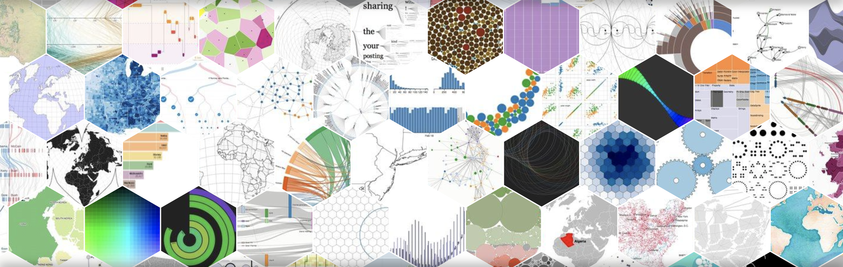
Some say that “a good image is worth a thousand words” and, either we agree with this or not, data visualization has a very important impact in the communication of otherwise difficult to handle information as, e.g., large tables or multidimensional comparisons. Some could argue that even in the foundations of mathematics, this is an important role of Geometry in its relation to Algebra. Artificial Intelligence (AI) has become an integral part of our lives, from the digital assistants on our smartphones to the personalized recommendations on our streaming platforms. However, despite its widespread use, communicating the complexities of AI to non-technical audiences can be challenging. This discussion post is about the sophistication of data visualization, playing a vital role in presenting AI in a clear and understandable way, being careful about its misuse and inappropriate representation.
One of the key challenges with AI is the vast amount of data involved. To make sense of this data before offering its insight to management or to the public, it is often necessary to represent it visually. Sophisticated data visualization tools (such as the several Business intelligence products in the market) can help to transform complex data sets into easy-to-understand graphs, charts, and diagrams. This not only makes it easier for non-technical audiences to grasp the insights generated by AI, but also helps to identify patterns and trends that might otherwise go unnoticed. We can even make use of well established plugins to dynamic datasets such as, e.g., Kibana or Grafana, to prototype visualization dashboards without any code involved, allowing to support a brainstorm or discussion and prototype a ready-made real-time data visualization dashboard that can later be implemented with more efficient methods after its usefulness is assessed.
Undoubtedly, sophisticated data visualization can also help to enhance the credibility of AI by providing transparent and accurate representations of its outputs. With greater transparency, audiences are more likely to trust and understand the decision-making processes of AI systems, particularly in a time when the rapid spread of the digital transformation of many industrial and governmental sectors brings a great potential for AI-assisted decisions that can have significant impacts on people's lives. Storytelling with data is more and more often the vehicle to showcase the perspective insights obtained by exploratory data analysis that can help build a narrative within a certain context (have a look at the great Gartner’s Impactful Storytelling webinar or to Cole Nussbaumer Knaflic’s “Data Visualization Guide for Business Professionals”). Contributing to this aim, my colleague Alenka Guček, with whom I collaborate in several projects and initiatives, is also in the forefront of the data visualisation movement organising with Martina Zunica the Dataviz Challenge at the Journal of Data Visualisation (crowdsourcing in a very elegant way the creation of a dataviz movement), that was presented this year at the Outlier conference in Portugal.
With the explosion of interactive data visualisation, the inaccurate use of it to emphasise a certain aspect of a certain story brings mistrust to the message that is to be communicated. In that aspect, it is very important to ensure the appropriate care for the data visualisation used and how it is presented to the reader. The Evergreen Data’s “Data Visualization Checklist” can surely help the appropriate communication of the results highlighted by AI algorithms on the data. Also, the appropriate choice of the data visualisation to show a particular result can be key, and a simple runthrough the Data Visualisation Catalogue can help. It is also noticeable that sometimes great data visualisation can be used to manipulate the information that is communicated, and to avoid that we should bring to the AI literacy a great deal of data visualisation awareness. In recent years, there has been a growing concern about the impact of fake news on public opinion and democracy, with the potential to cause significant harm. Also in this context, AI is emerging as a potential solution to the problem of fake news, deconstructing manipulated images and videos (see the excellent work done by Euronews), as well as misleading headlines and clickbait.
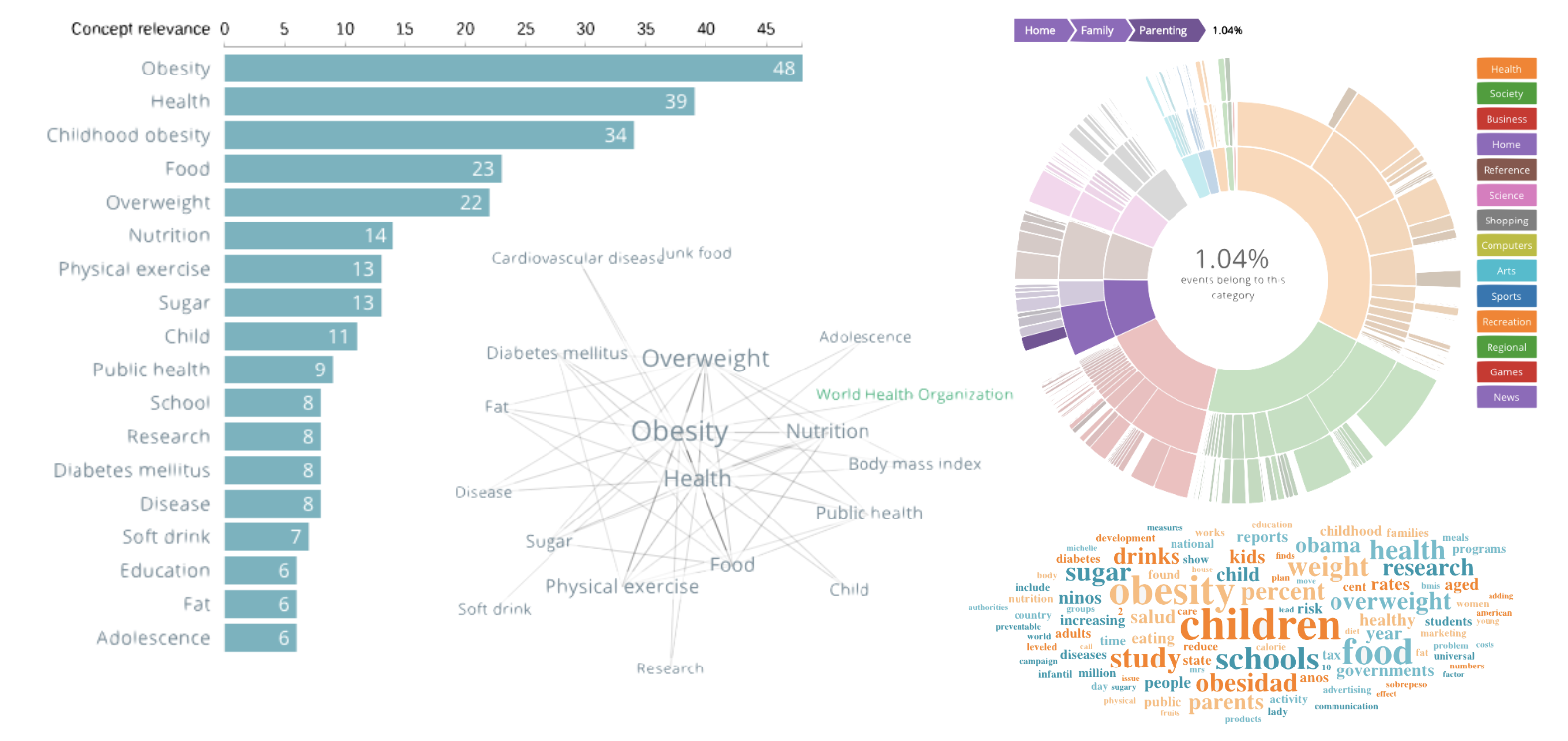
And as AI can profit of sophisticated data visualization for communicating the intricacies of its methods and outputs to non-technical audiences, AI can also be used to improve the data visualisation in itself. By presenting complex data sets in a clear and accessible manner, data visualization can be enhanced by the optimisation of the information provided, releasing the weight of information to showcase by learning trends in the data. It can also improve the efficiency of the real-time frequency of the data exposure, reducing the lag and improving the data discovery process. It can also improve the granularity of the insights found in the data, exploring a more complex connection between large datasets. With the exponential increase of the applications of AI, there is also an increase in its data visualisation use cases (as nicely discussed at the towardsdatascience.com), including finding outliers and anomalies, hyperparameter tuning, model performance evaluation, validating model assumptions, or in selecting the most important features and identifying patterns and correlations between features.
AI and data visualisation are a match made in data heaven, creating a symbiotic relationship that empowers organisations to navigate the complexities of big data. As this powerful union continues to evolve, we can anticipate even more transformative applications in industries worldwide, enabling us to harness the full potential of data and make informed decisions that drive progress, and helping to enhance the credibility of AI and improve public understanding of its capabilities. Tell us your opinion about this topic! Share your view on the topic of AI and data visualisation.


Completely agree—data…
Completely agree—data visualization is more than just aesthetics; it bridges the gap between complex models and human understanding. In our work with Roblox tools, clarity is everything. Here's something we’re working on that benefits from simplified design and scripting logic: https://inkgamescripts.com/